
Bife.work 13 years designing digital products that cut through the noise ✺ Startups, corporates, messy backends, clunky UX — I’ve been there, fixed that ✹ I like smart systems, bold ideas, and interfaces that don’t make people think twice ✴

01.
Doctolib Siilo ✺ is a secure messaging platform for healthcare
— Think of it as WhatsApp meets Slack, built for healthcare professionals.
Over the past 3 years, I've been responsible for designing on Siilo's core features team, including real-time messaging, voice and video calls, and secure patient case management, ensuring a compelling experience that's compliant with medical privacy standards.
In March 2023, Siilo was acquired by Doctolib, a leading French healthtech company. As Head of Product Design in Amsterdam, I had the challenge of leading the integration of our messaging platform into Doctolib’s OS, preserving Siilo’s identity while enhancing the experience for nearly a million professionals across Europe.
IMPACT
➞ As part of the medical verification initiative, we were able to increase the number of badged professionals from 26% to 54%
➞ As a result of the integration into Doctolib OS, the number of messages exchanged got near 1 billion and the daily active user rose to 54k in weeks
➞ Siilo app rating keeps a steady 4.9✷


As part of the Cockpit team at TomTom, I led the core UI stream for the TomTom Digital Cockpit team, aiming to redefine the future of in-car experiences. Together, our team of eight multidisciplinary designers built a groundbreaking automotive digital cockpit platform from the ground up, which has already started making a mark in the automotive industry.
As a white-label digital platform, IndiGo integrates turn-by-turn navigation, media, climate controls, voice assistants, and third-party apps into a seamless, driver-focused experience.
IMPACT
➞ 1 billion messages exchanged.
➞ Userbase increase from 300k to 1 million users.
➞ Daily active users increased by 23%


02.
TomTom IndiGo ❋ is a next-gen navigation and cockpit platform
— Think of it as a customizable operating system for car dashboards.
INITIATIVES HIGHLIGHTS
-
TomTom's in-car navigation interfaces needed a cohesive design language that allowed carmakers to infuse their unique brand identities, ensuring a consistent and personalized user experience across diverse vehicle models.
Within a specialized, lean team of designers, I led the development of a versatile UI design system for TomTom's Navigation User Interface (Nav UI). This framework empowered carmakers to customize elements—such as fonts, colors, and icons—to align with their brand aesthetics, facilitating seamless integration across various models.
The implementation of this adaptable design language set a new standard for TomTom, leading to the creation of TomTom's new design system.
> Adopted by multiple teams
> -
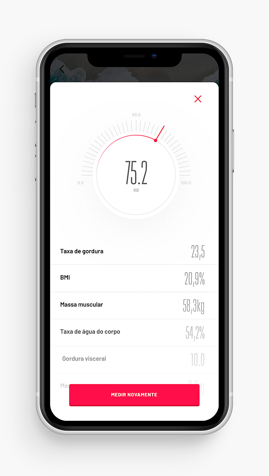
Healthcare professionals often struggle with managing multiple patient discussions simultaneously, leading to fragmented communication and potential errors.
We introduced the Patient Cases feature, allowing users to create dedicated projects for each patient.
Over 7 months, I led the end-to-end redesign of Mude's mobile app, working closely with the CPO and handpicking the engineering team that brought it to life.
The original back office system had limitations that hindered scalability and efficiency, such as manual processes or fragmented tools. This transformation not only supported the app's enhanced user-facing features but also ensured that the operational backbone could handle increased demand and facilitate business growth.
After this comprehensive redesign, Mude's app didn't just get a facelift — it went through a new fitness overhaul. The result? A surge in user adoption and class bookings. And yes, the app's looking pretty sharp, too.
high retention rate of 70% as sense of community etcetc


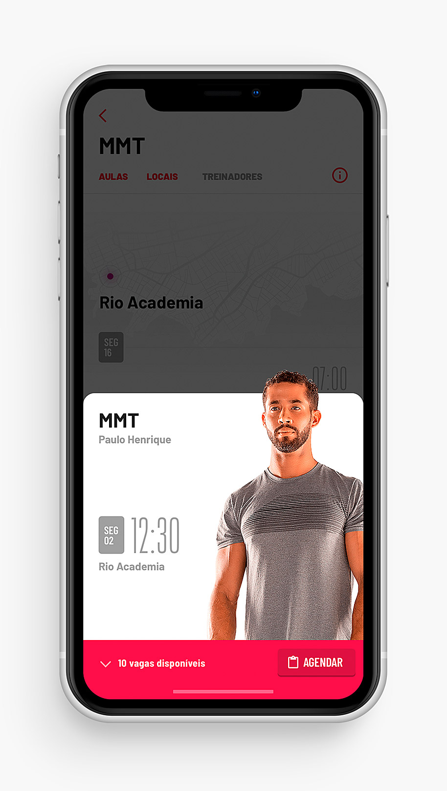
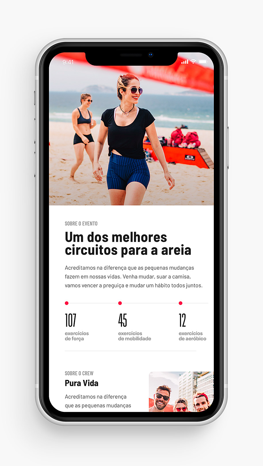
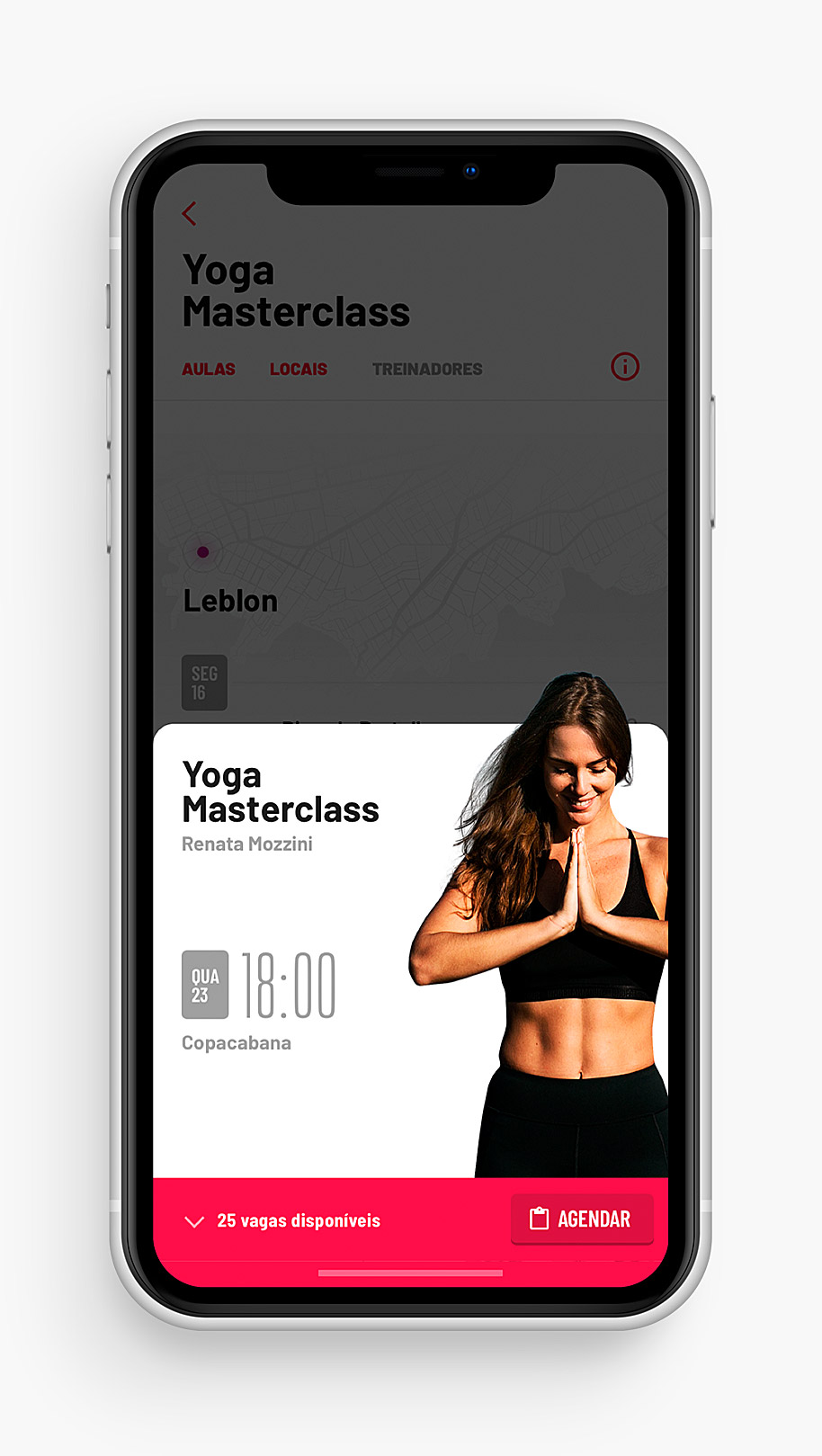
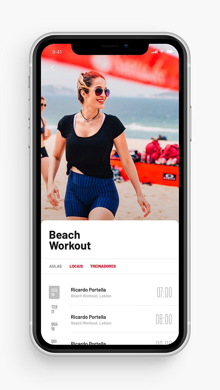
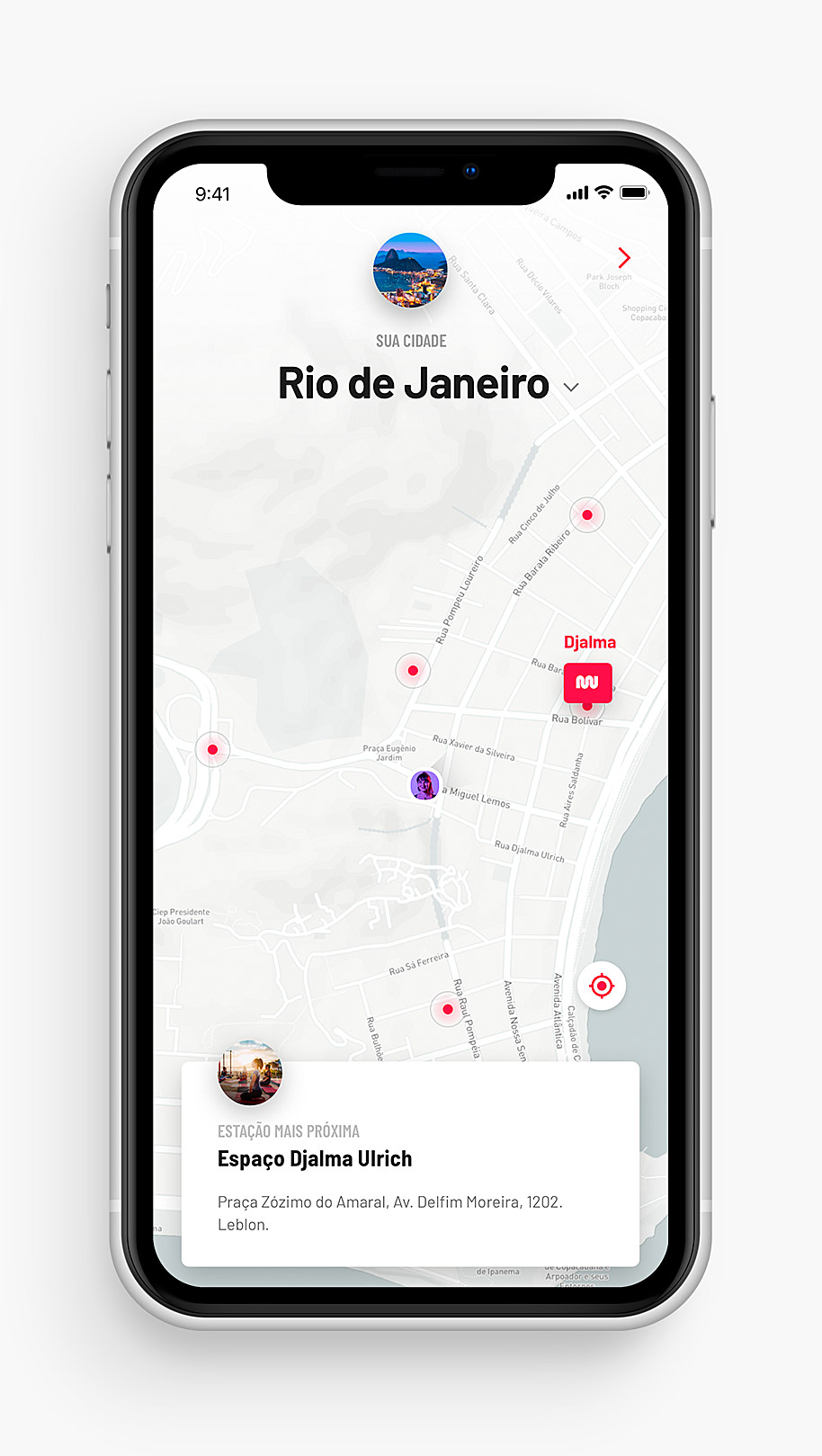
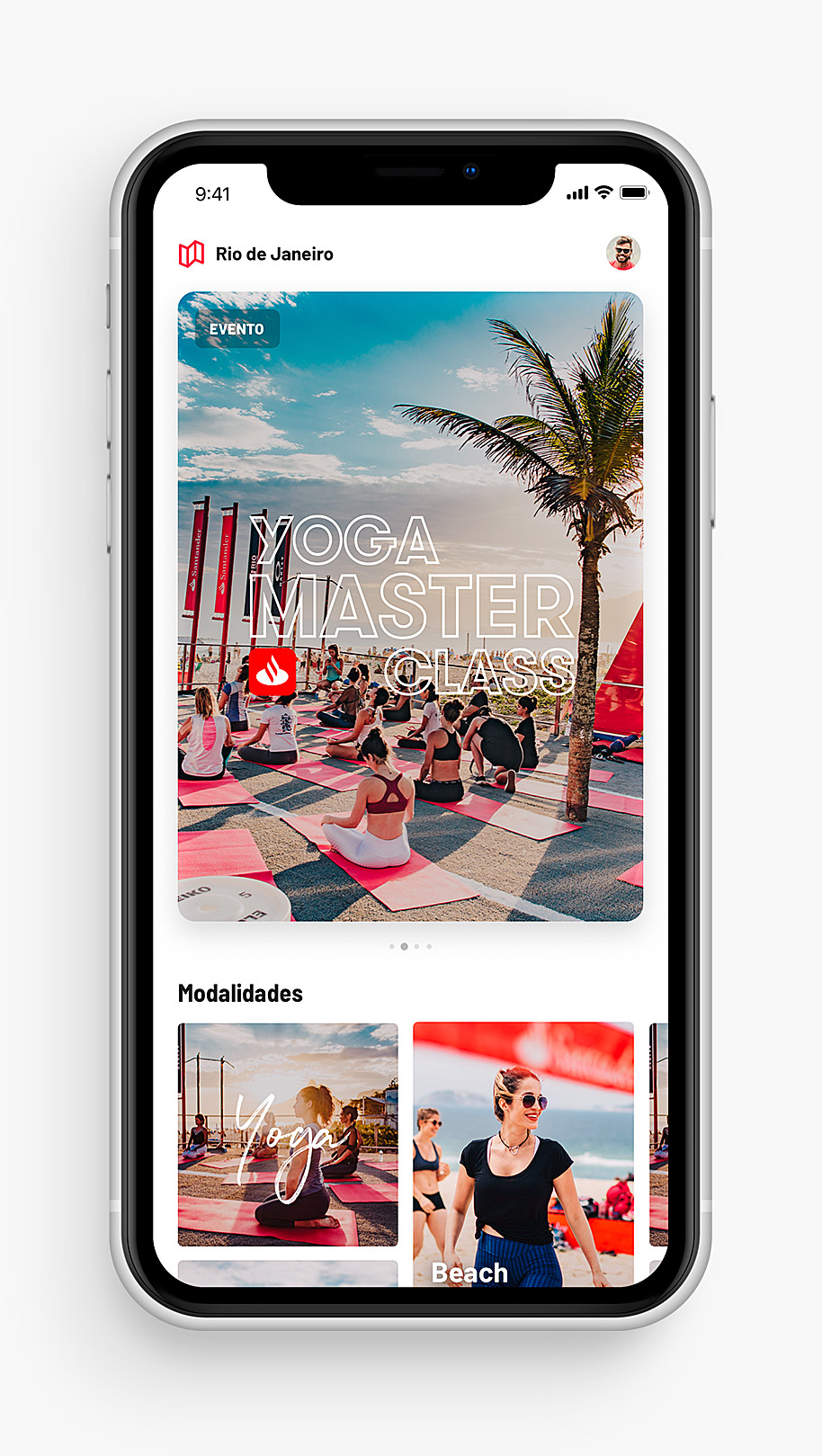
Mude.fit is transforming cities in wellness spaces for people.
— Think of it as ClassPass meets outdoor fitness, where anyone can book yoga, training, and wellness classes in public spaces.
INITIATIVES HIGHLIGHTS
-
Mude's old brand expression lacked a cohesive visual identity and user interface, resulting in an inconsistent user experience that hindered engagement and scalability.
We undertook a comprehensive redesign, developing a unified UI system and refreshing the brand to ensure consistency across all platforms. This included standardizing design elements, color schemes, and typography, as well as aligning the app's aesthetics with Mude's mission to promote outdoor wellness.
-
Mude's initial administrative tools were fragmented and inefficient, hindering the company's ability to scale operations and effectively manage an increasing number of users and class offerings.
We led a comprehensive overhaul of the admin system, developing a unified platform that streamlined class scheduling, instructor coordination, and user data management. This new system automated manual tasks, improved data accuracy, and provided real-time insights into operations.
The revamped admin tool significantly enhanced operational efficiency, enabling Mude to scale from 5,000 to 500,000 users within a year. -
The comprehensive redesign of Mude's app, including both the user-facing application and the back-office system, was accomplished over a period of seven months. This strategic overhaul significantly contributed to the platform's scalability and user engagement.